Forms can be used to collect information from website visitors, from pre-planning forms to general questions. You can create new forms on any page on the website.
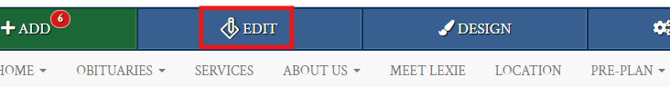
When logged into the website and on a page that you want to add a form, click on the “Edit” button in the blue bar at the top of the page.
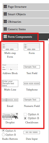
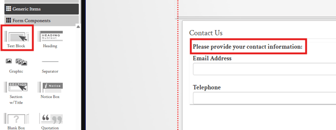
A sidebar will appear on the left of the page. From the categories, click on “Form Components.” This will open up the available list of form components that can be used on the page.
Adding a Form
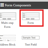
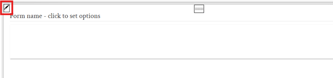
Before you can start adding form components, you need to add the form component which acts as the container for all the other form components. Drag and Drop the "Form" component where you want the form to be on the page.
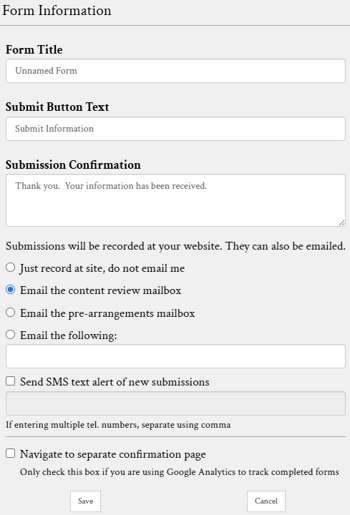
The form component will initially be empty except for a form name, to customize the form name, click the pencil icon on the left corner.
Information such as form name, submit button text and submission confirmation message can all be customized in this window. Settings are also available to customize where this form is sent to once a submission is completed.
Adding Form Components
Now that a form is added on the page, components can be dragged and dropped into the form to build out the form. All the components under form components are for information entry and selection. These are all the components that a user would interact with to enter or select information such as typing their name, selecting dates and answering multiple choice questions to collect necessary information. On top of these form components, other components from smart objects and generic items can also be added to a form to help create the overall form design.
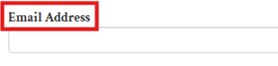
For example, if I wanted to add a sentence to a section on the form before collecting information with form components, I could add a text box from the generic items section and type a message in on the form. In the example below, the email address and telephone components are from the form components section, but the highlighted message is using the Text Block component from generic items.
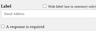
Form components have some additional settings that can be customized by clicking the pencil icon in the upper left of the object.
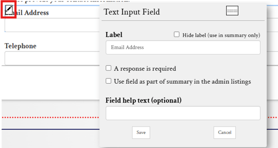
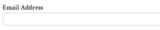
The label field changes the text that appears above the input. In the example below the words "Email Address" are the label text and the box below that is where the user can type their email address.
Toggles are also available to make the response required, or hide the label if needed.
Here is a breakdown of the various form components and what they do:
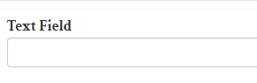
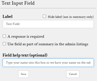
Text Field
A text field is a basic form component that allows visitors to enter a single line of text.
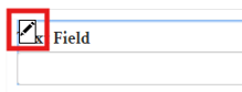
To make changes to the text field component, hover your mouse over the text field and click on the pencil button in the top left corner.
Use the pop-up box to change the text field label. The label should tell users what information to type into this section, for example if they need to enter their name then the label would simply be "Name". Field help text is an optional feature that creates text below the field to further explain what they should type into the box.
Multi-Line Text Field
A multi-line text field is a larger text box that allows users to enter longer messages.
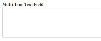
When editing this object, you will be presented with the same options as the regular text field.
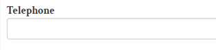
Telephone Field
The telephone field is the same as a text field but it will format the phone number into a phone number format when submitted.
Email Field
The email widget is a text field that will format an email address when submitted.
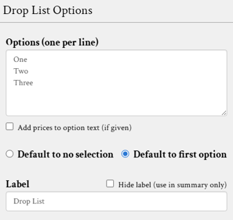
Drop List
A drop list widget allows users to select from options specified in object settings.
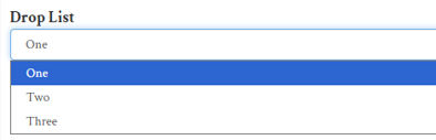
When editing the drop list, enter options in the large text box with one per line. These will be the options users can choose from when entering a form.
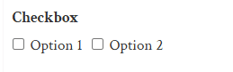
Checkboxes
Checkboxes allow users to select multiple options on a form. Options are entered the same way as the drop list widget shown above. Each option can be selected by clicking the box next to the listing.
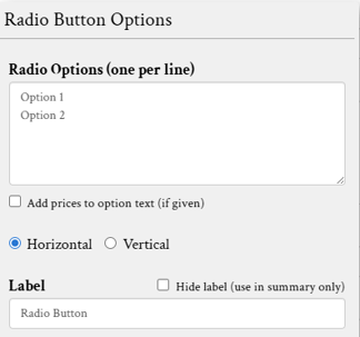
Radio Buttons
Radio buttons are similar to checkboxes in format but only allow one option to be selected.
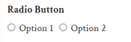
Each item can be displayed either horizontally or vertically by clicking the radio buttons below the text field.
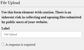
File Upload
The file upload widget allows users to submit a file, such as a picture or document when entering a form.
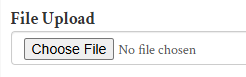
The widget label can be specified in its settings.
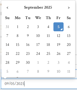
Date Input
The date input component allows users to use the date picker feature.
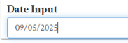
Clicking on the text field will open the picker. Users can still type out the date, or simply click on the day they would like to enter.
Section Label
The section label helps organize forms by creating a title and separator.
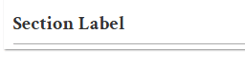
This object does not affect form submissions but helps to format different sections of the form.
Security Question
You should include a security question at the bottom of every form. This anti-spam object requires users to answer a basic math question to decrease the likelihood of spam.
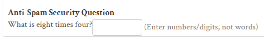
The security question is always a required object. When added, users cannot submit forms until they have filled in the question.
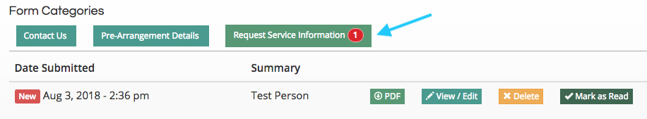
Viewing Form Submissions
All form responses will be recorded on your site in the “Website Form Responses” section. Click the green “Add” button in the top left of the page to access it from the drop-down menu. A red indictor number will show beside website form responses to indicate if there are any new and unread responses.
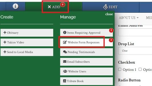
Responses will be recorded under the name of the form. They can be viewed, downloaded, and deleted from this page.